Case Study
Real Estate Portal Redesign
Overview
Motivation
Purchasing a house is stressful to begin with, so having a proper tool that can help users browse will improve the overall experience.
Challenge
The website used by most real estate agents and their clients in Ontario is difficult to navigate, not appealing and frustrating for multi-user purposes.
Goal
The designed product will help users have a seamless browsing experience and improve relationships between buyers and real estate agents.
Role & Responsibilities
Role: Product Design, UX Research
Design Process
Assumptions
Several assumptions were made during the design process.
- Account based: user permissions will vary between buyer and agent.
- Age range: varies (18+)
- Main audience: real estate clients and agents
- Competitors: public real estate platforms
- Project Scope: user experience for the home buyer persona, the site perspective for a buyer
User Research
User research interviews were conducted for two primary personas: a first-time home buyer and an experienced home buyer. The main purpose of the interview was to reveal some of the main pain points users experience. Using a set of questions to help guide the conversation, I sat with three people and discussed the site.
Questions Asked:
- How do you first get to the page?
- What were you hoping to get from this page?
- Is there anything that particularly stands out to you?
- What is your ideal process?
- What information do you walk out with?
- What is the biggest pain point of using this website?
Pain-Point Definition:
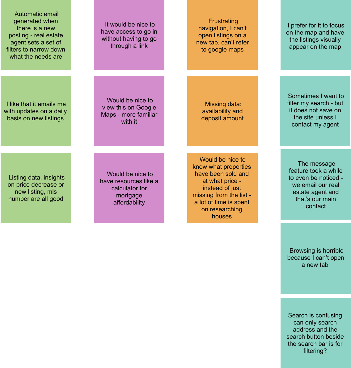
Based on the interviews and the answers provided, as well as some of my own observations, I compiled a list of pain-points:
- Unable to share properties with others
- Need to gather information and externally send to agent about a property of interest
- Searches are not saved
- Search functionality is overall confusing
- Navigation not clear
- Unable to use browser back and forward buttons
- Cannot open new tabs to view houses
Competitor Research
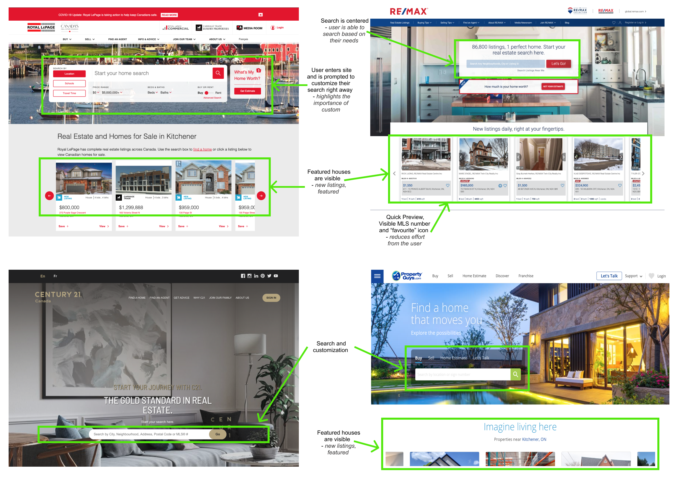
Following the user interviews, my next step was to review some of the other popular real estate market platforms.
What I captured...
- The landing page for all the platforms involved a search or customization component
- Most of them had a list of featured listings
- Saving or favouriting listings through visible icons
- Save search functionality
- Alternative viewing options including listings and map view
- Some items were not applicable to the project since it is an agent ran site (i.e. "look for agent" or "sell" would not apply)
Ideation
The approach for ideation involved focusing on the landing page of the site and then spiraling out to other functionality. The reason is because the path taken to the site is via a link provided by the agent of a particular listing or to the main landing page. Once the user has viewed the listing, they are likely to go back to the landing page and perform action items.
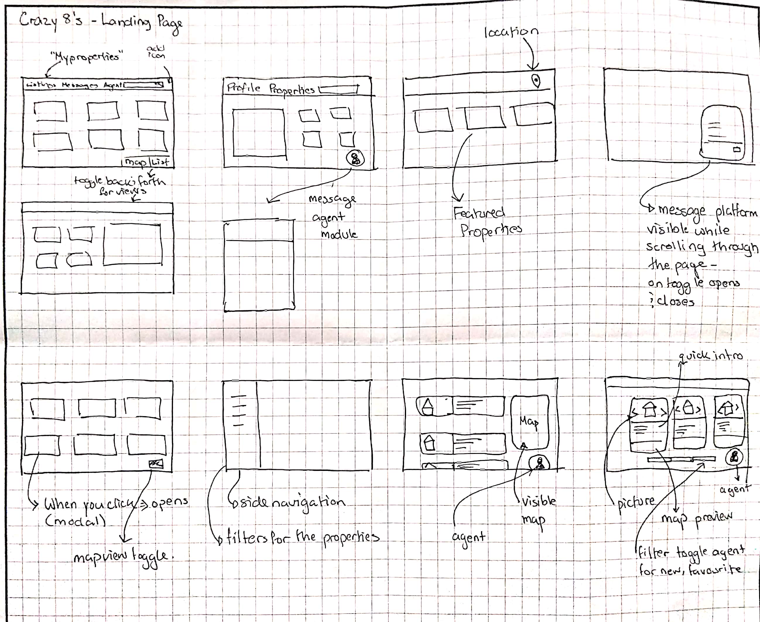
To visualize some ideas, I performed a "Crazy 8's" session for the landing page. From this session I captured several items: agent chat, views, search, and a sort toggle.
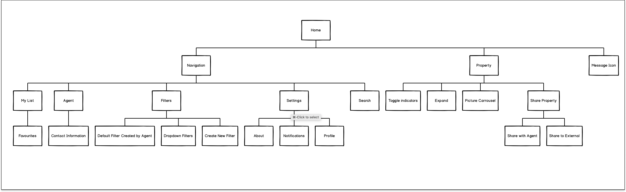
I also created a hierarchy diagram to visualize the overall structure of the site.
Prototyping
Using Balsamiq, my first step to prototyping was to create low-fidelity prototypes of new functionality.
Overall, my approach was too simplify the page so that the navigation was seamless and intuitive while staying true to the current structure.
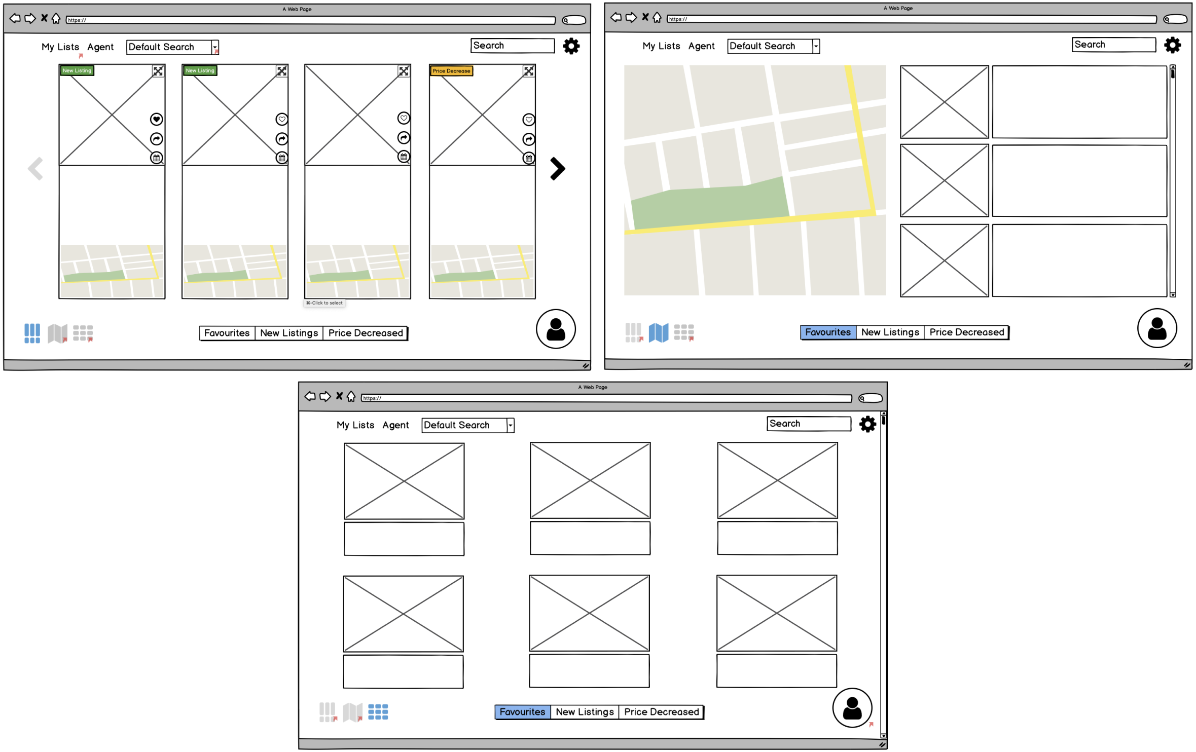
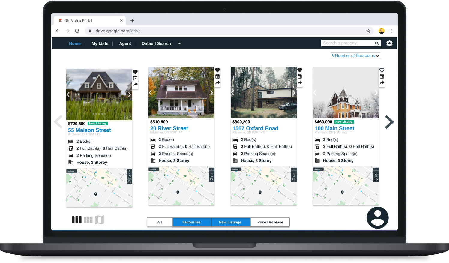
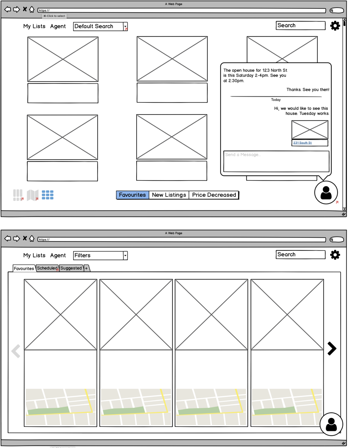
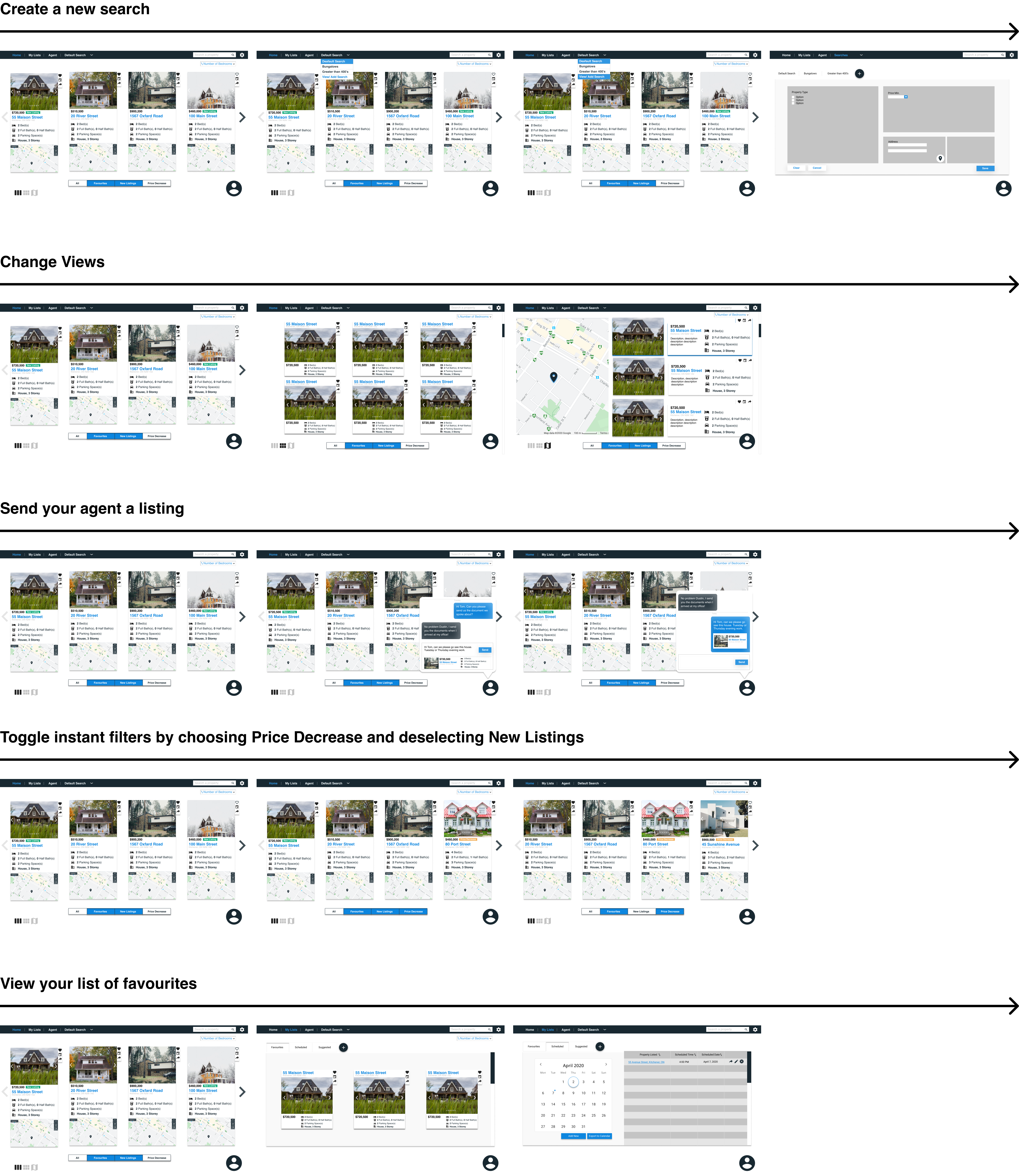
The first set reflects the different types of view types, as well as toggle sort. The map and grid view remained the same, but an additional view was added that contained all the important information (picture, details, and map).
Additionally, I restructured the listings to include more visible tags and action items, which include favourite, share, and schedule
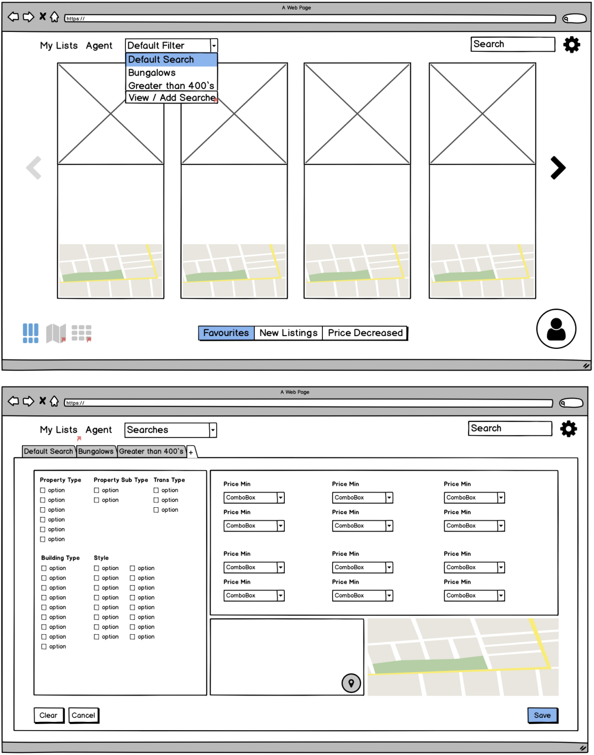
One of the main pain-points was on search functionality. Here, I aimed to separate the customized search vs. the general search bar.
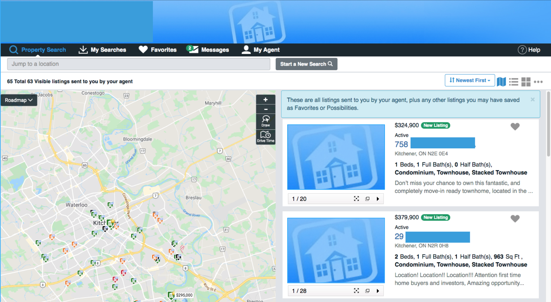
Users can also save their search and access their list of searches - upon selection they can apply one to the view.
Two other functionalities were introduced..
The chat functionality would allow users to share their listings with their agent on the platform chat - not having the need to message them externally.
A list functionality would allow users to access their favourites and scheduled listings
Final Design
For the final design, I created mid-fidelity prototypes for 5 different workflows using material design UI concepts to illustrate how each of the new functionalities would work.
Key Take-Aways
Main Page:
The main page is the most critical for this site because it acts as the dashboard and starting point for other actions.
Toggle:
The sorting toggle would facilitate the navigation for users to see between new listings, favourites and price decreases with minimal effort.
My Lists:
The new functionality of being able to schedule, favourites, and other types of lists needed to be stored in one place and be intuitively accessible.
Views and Action Buttons:
Adding the "all-in-one" view for the listings minimizes the navigation needed between the other views or external navigation for more information. The action items allow users to favourite, share with their agent, and request a booking.
Agent Chat:
The site currently has a messaging system but it is hidden and forgotten by both parties. Adding a more "instant chat" feel and look can incentivize users to use it and remain on the site without having to externally message, as well as being able to share the listing within the site to the agent.
Reflection
User Interviews: Further insight from an agent could have been beneficial to the chat and booking functionality. Unfortunately, I was not able to contact participants but feedback and pain-points would be equally important.
Competitor Review: Apart from viewing the site itself, deeper research into user reviews/forums about the site could have uncovered more pain points.
User Testing: Once getting a low-fidelity mockup, I reviewed the site with a mentor of mine where I was able to get great feedback. In addition to this, further testing could be done on the low-fidelity or workflows by users of the site.
Acknowledgements: Having this been my first project, I was fortunate to get advice and mentorship from Philippe Jean, who guided me through to the mid-fidelity stages of the project.
Go back to projects